A Rare Freedom

Following up on our last post about some of the album art on ECM's label, we take a look this week at the work of one of its principal designers, Barbara Wojirsch.

Barbara Wojirsch's design for Keith Jarrett's In the Light (1973).
Edition of Contemporary Music (ECM Records)
Wojirsch began her artistic life as a painter but soon turned to design. Along with her husband, Burkhardt Wojirsch, the duo joined ECM founder Manfred Eicher in the early 1970s to create a lasting visual brand for that label. Burkhardt died not too long after he began working at ECM, but Barbara stayed on and was joined by another talented artist, Dieter Rehm, in the quest to articulate ECM's music through image and text.
Throughout the early days of vinyl recordings and well into the second half of the twentieth century, musicians had little input as to the visual look and feel of their record's packaging. But that did not mean that designers were not directed by the companies they worked for to create specific imagery also. The very special thing about ECM is that their visual brand was simply the content that Wojirsch and Rehm created.
“Enjoying a rare freedom unencumbered by commercial restraints, Eicher, Wojirsch and Rehm have created a body of work which, paradoxically, adheres to the rules of corporate identity and brand management, but is generated by artistic conviction and personal vision rather than commercial priorities.”
Inspiration
Much of the ECM catalogue makes use of enigmatic, haunting photographic imagery that connotes vastness if not loneliness. The visuals seem to make room for the music to exist within them, rather than explicitly labeling the type of sound within an album. Rehm should receive a lot of credit for sourcing such photographs, but it is Wojirsch who created some of the most exciting type treatments for the ECM catalog. Her influences were wide-ranging across many different eras of art. Wojirsch found inspiration in ancient Egyptian hieroglyphics; the abstract expressionist paintings of Cy Twombly; and the sans serif typography of modernist designer Jan Tschichold.
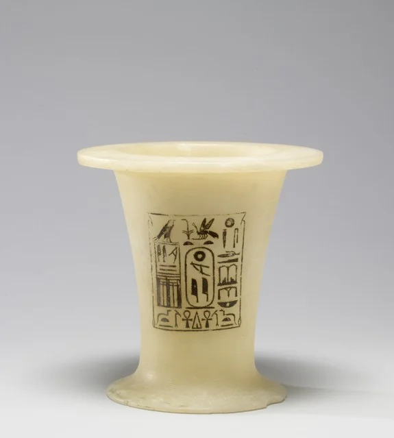
Jubilee Vessel of Pepi I (ca. 2290 BCE), collection of the Walters Art Museum

Barbara Wojirsch's design for Keith Jarrett's The Cure (1991)
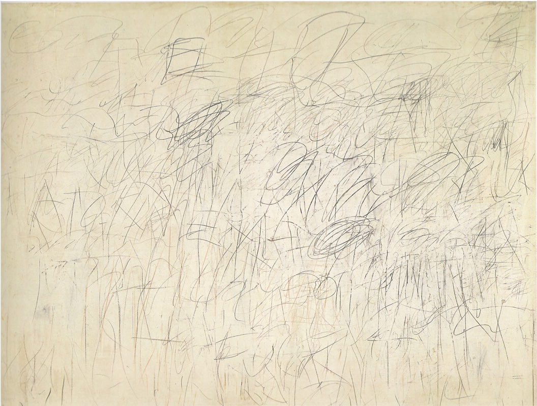
Cy Twombly's painting Academy (1955)
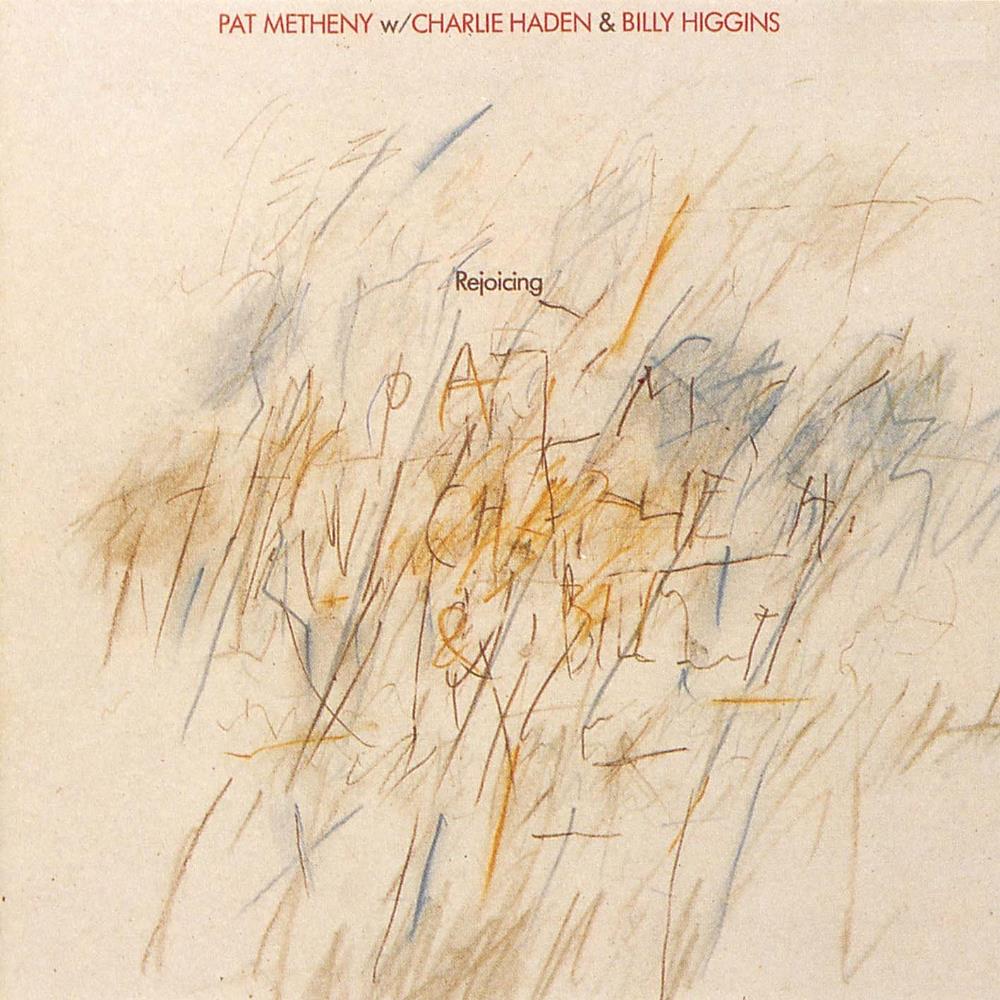
Barbara Wojirsch's design for Pat Metheny's Rejoicing (1984)

Some of Jan Tschichold's designs for Penguin Books

Barbara Wojirsch's design for Jan Garbarek's Twelve Moons (1992)
Further reading:
More beautiful images of Wojirsch's album covers are on Hard Format's website.
Eye Magazine has published a few articles on ECM's designers. We sourced the quote used in this blog post from Adrian Shaughnessy's 1995 essay.